


To celebrate its 15th season, ET Canada did a full re-branding. Graphics, colours, logos and photos were re-imagined to keep the show fresh. The focus was flexibility, cleaner lines, smarter minimalist designs and eye catching motion graphics.

Photo by Katherine Holland
___________
The motion graphics package was designed to compliment an increased focus on social media. Fun retro elements like pixel art, low poly backgrounds and turntables became part of the overall look. Modern elements like battery chargers and earbuds were also incorporated.


___________
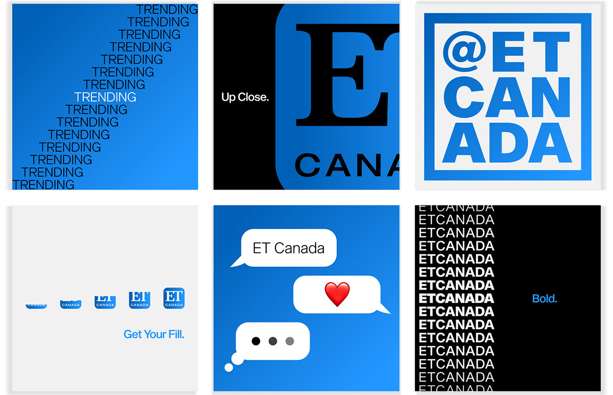
Our logo was moved away from a gold primary colour to a more bold blue. The dividing bar was removed to increase visibility, and serifs were removed from "Canada" to modernize the overall look while preserving the logo identity.


____________
A less is more approach was used for print materials. Symbolic typography was used to keep things minimal, bold and visually interesting.


____________
The high contrast in the redesigned logo worked wonders with print projects. Higher visibility was achieved on large and smaller scales. The bold blue colour helped projects stand out against any background and on any material.


Photo by: AOC Photography
____________
The flexibility of the logo allowed for a set animated emoji to be created for social platforms. The character used both the rounded rectangle and the blue colour scheme as a base.


____________
ET Canada Live, our social media streaming show was given a refresh. The immediate nature of the show requires many interacting layers to work together seamlessly and in real time. The updated look allows for lots of information to be displayed at once without compromising an elegant, balanced graphic look.


Photos by: AOC Photography
____________
In response to the Covid 19 pandemic, ET Canada @Home was created. The daily show was maintained, but from the safety of everyone's home. A show re-branding was created to accentuate this new approach to daily television. The use of the location pin emphasised the concept of home being a location rather than a traditional house. This helped avoid the typical concept of a house logo, and made the overall concept more inclusive to all living situations.


____________
Our studio was updated to include our new branding, custom desk and set pieces, as well as a complete relighting to accommodate the increase in white and blue tones.

Photos by: AOC Photography
____________
The overall branding philosophy moved away from strict branding guidelines in favour of flexibility. This allows easier brand integration possibilities and keeps the show interesting and unpredictable. The result is a core that remains consistent, but a perimeter that is malleable. In this scenario, the creative possibilities are endless!


